


原文地址:TornadoFx中的css美化 - Stars-One的杂货小窝
TornadoFx中使用类重新对css进行了封装,所以可以用代码的形式来书写样式
说明
除了Text,其他的若是要修改文字颜色,css的属性均为textFill,而不是fill
换行: Text 设置wrapWidth Label 设置isWrapText属性
示例(JavaFx -> TornadoFx)
下面的示例中将常规的JavaFx的样式转为对应的TornadoFx的css样式,主要是对原本JavaFx中的进度条进行了美化
.progress-bar {
    -fx-indeterminate-bar-length: 60;
    -fx-indeterminate-bar-escape: true;
    -fx-indeterminate-bar-flip: true;
    -fx-indeterminate-bar-animation-time: 2;
}
/*进度条颜色*/
.progress-bar > .bar {
    -fx-background-color: #37C796;
    -fx-background-insets: 3 3 4 3;
    -fx-background-radius: 2;
    -fx-padding: 0.75em;
}
.progress-bar:indeterminate > .bar {
    -fx-background-color: linear-gradient(to left, transparent, -fx-accent);
}
/*背景*/
.progress-bar > .track {
    -fx-background-color:#292E48;
}
下面即TornadoFx中定义的样式
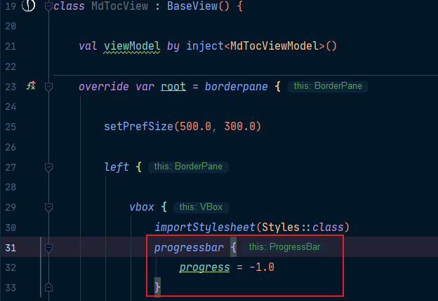
class Styles : Stylesheet() {
    companion object {
         val progressStyle by cssclass("progress-bar")
    }

    init{
        progressStyle {
            indeterminateBarLength = 60.px
            indeterminateBarEscape = true
            indeterminateBarFlip = true
            indeterminateBarAnimationTime = 2

            select(".bar") {

                backgroundInsets+=box(3.px,3.px,4.px,3.px)
                backgroundRadius+= box(2.px)
                padding= box((0.75).em)
            }
            and(indeterminate){
                select(".bar"){
                    backgroundColor+=LinearGradient(0.0,0.0,1.0,0.0,true,CycleMethod.NO_CYCLE, Stop(0.0,c("black")),Stop(1.0,c("red")))


                }
            }
            select(".track"){
                backgroundColor+=c("#292E48")
            }

        }
    }
}
PS: 上述的代码,是直接覆盖了原来的progressbar的样式
如果是单独用View打开测试,需要在View里加上加载style的代码
importStylesheet(Styles::class)
如果是直接启动了Application,则不需要了,之后再你使用progressbar的时候,样式都会直接变成上述设置的样式了
效果:

动态主题切换
暂时还没有深入研究,下面代码是复制了某位大佬的记录
import javafx.scene.paint.Color
import javafx.stage.Stage
import tornadofx.*
import kotlin.reflect.KClass
class LearnApp : App(ThemeView::class){
val themeController: ThemeController by inject()
override fun start(stage: Stage) {
super.start(stage)
// Make sure we initialize the theme selection system on start
themeController.start()
}
}
class ThemeController : Controller() {
// List of available themes
// val themes = listProperty<KClass<out Stylesheet>>(listOf(LightTheme::class, DarkTheme::class).asObservable())
val themes = listProperty(listOf(LightTheme::class, DarkTheme::class).asObservable())
// Property holding the active theme
val activeThemeProperty = objectProperty<KClass<out Stylesheet>>()
var activeTheme by activeThemeProperty
fun start() {
// Remove old theme, add new theme on change
activeThemeProperty.addListener { _, oldTheme, newTheme ->
oldTheme?.let { removeStylesheet(it) }
newTheme?.let { importStylesheet(it) }
}
// Activate the first theme, triggering the listener above
activeTheme = themes.first()
}
}
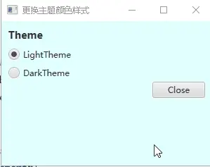
class ThemeView : View("更换主题颜色样式") {
val settings: ThemeController by inject()
override val root = form {
fieldset("Theme") {
field {
vbox(10) {
togglegroup {
// One radio button for each theme, with their value set as the theme
settings.themes.forEach { theme ->
radiobutton(theme.simpleName, value=theme)
}
// The toggle group value is bound to the activeThemeProperty
bind(settings.activeThemeProperty)
}
}
}
buttonbar {
button("Close").action(this@ThemeView::close)
}
}
prefWidth=300.0
prefHeight=300.0
}
}
// Two themes for completeness
class DarkTheme : Stylesheet() {
init {
root {
backgroundColor += Color.DARKGREEN
}
}
}
class LightTheme : Stylesheet() {
init {
root {
backgroundColor += Color.LIGHTCYAN
}
}
}
评论区